
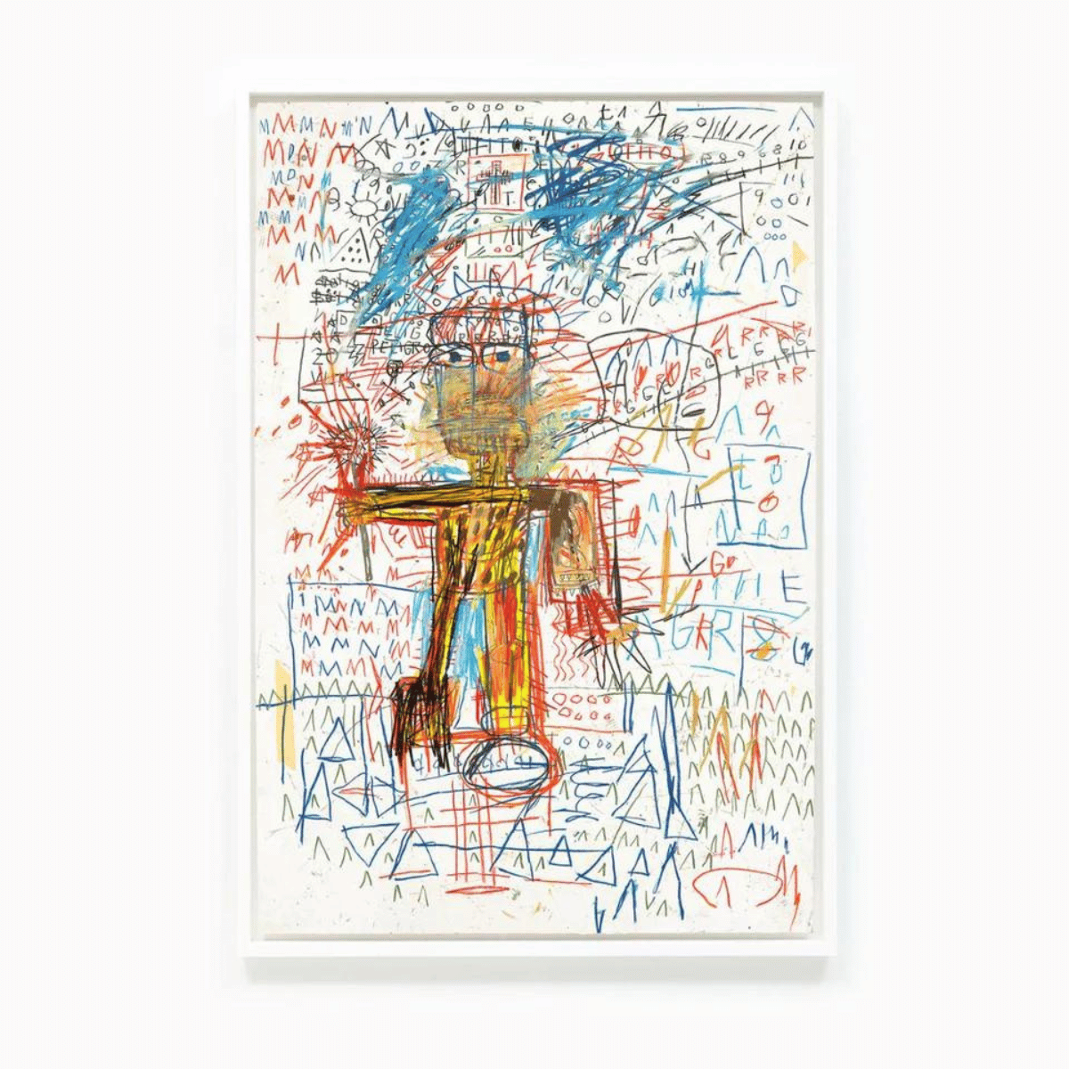
David Shrigley, Time To Choose, 2004
Time To Choose (2004) – David Shrigley Screenprint
About the Work
Time To Choose (2004) is a striking David Shrigley screenprint that encapsulates the artist's celebrated early aesthetic. Executed in a stark monochrome palette, the composition utilises heavy black ink against a crisp white paper background to present a characteristically minimalist visual field. The hand-rendered text and raw graphic lines immediately draw the eye, demonstrating the artist's mastery of simple yet profound visual communication.
By reducing complex human agency to a stark diagram in Time To Choose, the work confronts the viewer with the pure absurdity of modern decision-making. The crude drafting of the central motif strips away the gravity of existential choice, replacing anxiety with a dark, deadpan humour. This tension between heavy thematic content and a deliberately simplistic rendering is central to the work's enduring intellectual appeal.
David Shrigley
Celebrated for his satirical take on everyday life, David Shrigley has established himself as one of the most significant British contemporary artists. His celebrated public commissions, including the Fourth Plinth in Trafalgar Square and his coordination of the Royal Academy Summer Exhibition, have cemented his cultural legacy. Today, his works are held in prestigious public institutions globally, from Tate in London to the Museum of Modern Art in New York.
Translating his spontaneous line drawings into fine art editions allows the artist to preserve the raw immediacy of his sketchbook entries. Each David Shrigley print acts as a democratic vehicle for his distinctive worldview, bridging the gap between high art and popular culture. Through this transition, the fleeting nature of his hand-drawn thoughts receives a permanent, authoritative presence.
Screenprint Process
Published as a highly scarce release, this screenprint highlights how early print editions in the artist's career were produced with exceptional attention to material quality. The rich, opaque black ink is applied heavily to premium Somerset wove paper, creating a tactile contrast that offset lithography simply cannot replicate. This precise ink application ensures that the graphic weight of the original drawing is perfectly preserved with an archive-grade finish.
Working closely with publishers like Stephen Friedman Gallery, the artist utilises the screenprinting medium to elevate his quick-witted ink drawings into enduring physical objects. This David Shrigley limited edition print captures the subtle texture of the original hand-drawn line, retaining every deliberate wobble and imperfection. The resulting edition possesses a graphic clarity that resonates with clarity and directness.
Collectability
Works from this specific era command significant collector interest due to their historical positioning in the artist's trajectory. The clean, text-driven compositions from the early 2000s are highly sought after by collectors who appreciate his most direct and recognisable imagery. As a result, these foundational works have maintained a strong secondary-market presence internationally.
Representing a key piece from his celebrated institutional period of the early 2000s, the composition remains a particularly desirable example of his early career output. Because edition sizes from this developmental phase were often kept extremely small or remain unspecified, acquiring an authentic screenprint from 2004 represents a compelling opportunity for seasoned collectors. The scarcity of these early monochrome editions continues to drive their desirability in the contemporary art market.
Artwork Specifications
- Artist: David Shrigley (British, b. 1968)
- Title: Time To Choose
- Medium: Screenprint in black
- Dimensions: 70 x 50 cm
- Edition: Unknown
- Year: 2004
- Publisher: Pictures on Walls
Collect David Shrigley